Deliverable: Print Collateral

Our Work

Lawline

Heavy leather-bound books and Ionic columns may at one time have represented what it means to be a successful attorney, but today’s law professionals have evolved along with the modern world. Lawline is an online continuing legal education (CLE) provider with a robust library of content that helps attorneys stay ahead of the curve and practice at the top of their specializations. We worked with Lawline to create a new logo that conveys the passion for learning that connects its team and the customers they serve, using a flame-inspired shape that we then extrapolated to serve as a recognizable visual motif for the brand.

Objective

To update the company image and bring it in alignment with its focus on digital CLE that attorneys can access on their terms, any time, from anywhere

Our Work

Architecting Future Growth

Positioning a Locally-Based Engineering Firm to Compete on a National Level

David Mason & Associates is an architectural and engineering firm that focuses on designing and improving the essential infrastructure that makes our everyday lives possible. The firm was founded in 1989 in St. Louis, MO, offering architecture, civil engineering, and surveying services. Since its founding, it has expanded its expertise in structural engineering along with serving aviation, transportation, parks & recreation, power & utility, and municipal markets. David Mason & Associates has four regional offices in St. Louis, MO, Chicago, IL, and Philadelphia, PA.

Looking Toward Expansion

David Mason & Associates had established a solid reputation in their local markets over the past nearly 30 years by completing thousands of prestigious projects. As the next generation of leadership in the company prepared to take the helm, they approached goBRANDgo! for guidance on how David Mason & Associates could best position itself for growth. In the initial research phase, it was clear that the firm had amazing potential to become a major national player in its industry, but an outdated brand and website was standing in the way. So, goBRANDgo! set out to create an updated logo, brand identity, and website that would reflect the company’s prestige and expertise, as well as help propel David Mason & Associates to national prominence.

Thoughtful Execution

At goBRANDgo!, we employ a defined process of discovery when we are engaged in rebranding and website efforts. In our research, we discovered that David Mason & Associates was commonly known as “DMA” in the engineering community and industries they serve. In developing the new company logo, we created a mark that blended the company initials and engineered structures, with the goal of creating something that could eventually stand alone and would be instantly recognizable within the field. We also wanted to respect the proud history of the company while creating something simple and clean that would convey modernity and structure. 

In the website, the grid imagery present in the original logo was used as a design element throughout in order to visually communicate expertise in engineering. The color palette was updated, and the new site leveraged white space to show purpose-driven and clean as design values. The sitemap was reorganized to appeal to each of their target markets and make it easy to access information. 

In copy, David Mason & Associates’ engineering expertise was clear—however, with heavy use of industry verbiage, the value proposition of the company was lost on the reader. By simplifying the language and clearly communicating to each industry served, the company’s goal of improving essential infrastructure was pulled through as a theme of the entire site.

Finally, the website was mapped out and built in a way that guided the user down a series of defined paths based on personas developed by goBRANDgo!. Thanks to this mindful restructuring, the new website functioned in a way that fueled the growth of the business, instead of being a placeholder online.

Revealing DMA’s Competitive Clout

To mark the unveiling of the new company branding and website, David Mason & Associates hosted a launch party for all employees across St. Louis, Chicago, and Philadelphia. The celebration created buzz and energy among David Mason & Associates’ internal team, bolstering its already high morale and motivating team members to advocate for the business to potential clients and new talent. In addition, new leads began to stream through the website via contact forms, and David Mason & Associates received several multi-million dollar requests for proposals through the new online form.

David Mason & Associates also received recognition at the STL SMPS Marketing Excellence Awards in June 2018, an annual event that recognizes outstanding achievement in marketing communications by professional service firms in the design and building industry. David Mason & Associates was recognized with an Award of Excellence for its refreshed corporate identity, an Award of Merit for the newly launched website, and was named overall Best in Show by the panel of judges.

Through the rebranding efforts for David Mason & Associates, goBRANDgo! helped remove barriers to growth. By updating the look and feel of the brand, the innovation and expertise that were obvious to the company’s past clients and its team members were revealed to the outside world. Now, David Mason & Associates is receiving the attention it deserves from a wider, national market, and is continuing to accelerate revenue growth each year.

“goBRANDgo! did an exceptional job at developing a focused approach to our Brand Refresh which aligned with our strategic focus. From website content to sales and presentation collateral, the GoBrandGo team was professional and responsive to our needs. Ultimately, they made an intimidating process fun and collaborative.”

-Taylor Mason, Principal at David Mason & Associates

Our Work

Igniting Momentum: ÅirIQ Product Launch

About Cosasco

INDUSTRY: Atmospheric Corrosion Monitoring

Cosasco has been exclusively dedicated to corrosion management for over 70 years. They have a strong history of proven product and service solutions as well as a commitment to continue advancing the corrosion industry through innovation and expertise.

Results

Messaging, design, and strategic product launch of the ÅirIQ product

0

Units Sold

0

Units Quoted

What is ÅirIQ?

One type of corrosion that affects pulp and paper mill and data center environments specifically is atmospheric corrosion. Cosasco created ÅirIQ to help customers in these industries make better decisions about their corrosion management activities. What sets ÅirIQ apart is the hypersensitive electrical resistance technology (which indicates a corrosive environment before damage to assets can occur) coupled with the system’s ability to display real-time data.

This real-time monitoring helps ÅirIQ users stay ahead of corrosion, instead of spending time and resources fixing a problem after it has already occurred. This type of technology and information is game-changing for directors and engineers responsible for controlled environments.

Positioning and Launching ÅirIQ

Every project at goBRANDgo! starts with learning. We met with subject matter experts at Cosasco to learn the features and benefits of the product and gain a better understanding of the target audiences we were trying to reach. We were especially eager to learn about the audience for ÅirIQ because it represented an opportunity for Cosasco to penetrate new markets. Prior to launching ÅirIQ and a few other recent products, they had worked primarily in the oil and gas industry. We needed to ask a lot of questions to gain insight into the audiences of pulp and paper mills and data centers.

To get inside our prospects’ heads, we led a live rapid persona exercise with Cosasco where we delved into the problems, motivations, and desired outcomes for the different audiences they served. 

Once we had a good grasp on the differentiators of the product and the challenges of the audience, we brainstormed how copy and design could work together to create a compelling message. We presented three creative approaches and painted the picture for Cosasco about how each of them could come to life in the launch campaign and future messaging for ÅirIQ. We created sample ads with differing visuals and copy to illustrate what each idea could look like out in the wild.

Once we decided on the messaging and creative direction for the launch, our creative, strategy, and client success teams worked together to create a series of a deliverables and a plan for deployment. We decided that a mixture of traditional sales enablement tools and digital marketing tactics would give Cosasco the multi-channel support they needed to make the launch a success.

Deliverables we executed included:

  • Website Landing Page
  • Website Pop-Up
  • Sales Sheet
  • Digital Ads

The creative approach we landed on used both dark and light backgrounds to bring contrast with Cosasco’s existing visuals for other corrosion monitoring products, which featured mostly dark backgrounds. Since the launch had to appeal to markets outside of Cosasco’s core oil and gas audience, the visual differentiation helped solidify the uniqueness of the ÅirIQ product.

The visuals also incorporated an angular, all-caps sans serif typeface that lent a technological feel, along with other design elements reminiscent of data, which reflect both the capabilities of the ÅirIQ system and the data center environment that it is well suited for (among others). 

We began creating copy inspired by the idea of “invisible monsters,” threats lurking in the atmosphere just waiting to take down critical assets. We wove this concept into the content of the entire campaign, speaking to the way that ÅirIQ’s real-time data replaces uncertainty with confidence in controlled environments—making the unse

0+

Leads

0

Customer Trials

Results

Cosasco secured the first purchase order for ÅirIQ on the date of the product launch. In the three weeks that followed, they had sold 15 units, quoted over 40 units and had secured leads for 120 units. Three customers signed up for trials, and they were invited to speak at a few industry conferences about the product and its capabilities.

Protecting critical infrastructure from the harmful effects of corrosion keeps modern life as we know it up and running. After the momentum gained by this product launch, we’re continuing to work with Cosasco to refine their brand identity and reclaim their position as the go-to provider for corrosion monitoring solutions worldwide.

“Bringing a Cutting-Edge Corrosion Monitoring System to New Markets”

Cosasco

Our Work

Maneuvering for Growth: Innovating and Launching New Products with a Leading Domestic Chain Manufacturer

The customer is an industrial chain manufacturer that traces its roots back to 1854, when it began as a small blacksmith’s shop in St. Louis, MO. Its first products included the chain that hooked oxen to Conestoga wagons as pioneers began their journey west along the Oregon Trail. Today, the company has four facilities across North America that house over 250,000 square feet of manufacturing and distribution space. It produces chain for a variety of applications including overhead lifting, tow & binding, traction, and marine, among others. 

Facing Heavy Competition

The customer engaged goBRANDgo! to provide strategic guidance in honing its competitive advantage as the company prepared for a leadership transition. With competition from foreign-produced chain steadily on the rise, it was becoming urgent for the customer to differentiate themselves in an increasingly commoditized market. This challenge left us two choices: overpower the competition, or outmaneuver it. 

Despite the customer’s strong position as a highly reliable and well-respected manufacturer, we knew that attempting to overpower the competition with a big advertising budget or other conventional tactics would not be effective in differentiating it from its competitors. We began to brainstorm with their team about creating a new product that could fulfill customer needs that weren’t being met at the time. 

The Insight

We began our relationship with the customer (as we do with every one of our clients) with our immersion phase, in which we deployed our proven process that helped goBRANDgo! understand their business and industry through “day in the life” shadowing, competitor research, and customer interviews. The moment we stepped foot into the customer’s Fenton, MO facility, we understood instantly that safety is the first priority of both their operation and the products they produce, and every bit of information we learned after that supported this focus on safety.

Through our research, we also discovered that construction workers comprise only 4% of the labor force, but account for 21% of work-related fatalities. Also, between 2011 and 2015, half of all fatal crane-related injuries resulted from the worker being struck by an object, and 24% of all crane-related fatalities occurred in manufacturing and industrial settings. So, as we continued to brainstorm with the customer’s team, we sparked an idea: what if there was a way to make industrial chain easier to see?

A Chain Like No One Had Seen Before

The customer’s team got to work developing this new product, and as a result of their expertise and ingenuity, produced a chain that was 20% stronger and lighter than any other U.S.-made chain, as well as featuring a brightly-colored powder coated finish. Two finish colors were developed, a bright yellow and a bright green, in order to visually indicate the grade of the chain. 

goBRANDgo! was tasked with naming this innovative new product, and our team conducted a series of structured brainstorms to create a name that would communicate the benefits and quality of the new chain. Thus, Hi-Viz was born. As a result of the collaboration of the customer’s and goBRANDgo!’s teams, they were able to go to market with a product unlike any other in the industry. 

For the launch of Hi-Viz chain, goBRANDgo! created a marketing campaign to educate customers and create excitement for the new product. The campaign included direct mail, an email drip campaign, a website landing page, and other supporting materials to help the customer’s sales team and distributor partners demonstrate the value of Hi-Viz chain.

Safety, Strength, and Profitability: A Win-Win-Win

Hi-Viz chain increases the safety of the environments in which it is applied by making the chain stand out from the environment—whether in a manufacturing plant or outdoor construction setting. With loads weighing as much as 100,000 tons being lifted overhead regularly, the greater the visibility of the equipment being used, the safer the site becomes. Not only does Hi-Viz chain help address safety concerns, but its lighter weight and stronger capacity also make it a more effective product for consumers and increases margins for the customer.

In a highly commoditized industry, the ability to think strategically and differentiate yourself from the market is paramount. It spells the difference between growth and decline. Waging a war of attrition in such an environment is risky—it’s unlikely to work, but is sure to be expensive. At goBRANDgo!, we prefer to help our clients develop a maneuver strategy, which leverages innovation and agility to help them occupy new spaces in their industry that create competitive advantages in ever redder oceans.

Our Work

Equipping Success: Banner Fire Website

About Banner Fire Equipment

INDUSTRY: Fire Equipment Distribution

Banner Fire has been equipping firefighters and emergency responders across the Midwest with best-in-class fire and rescue apparatus, gear, and tools for nearly four decades. Their modern 39,000-square-foot facility ensures they have what emergency responders need to protect their communities.

Results

Updated website and e-commerce experience that helps emergency responders get what they need quickly.

0

Manual Hours Saved

$0

Cost Savings

Equipping for Success

Banner Fire has been equipping first responders and firefighters with the tools they need to protect their communities for nearly four decades. Their 39,000-square-foot facility houses everything an emergency responder needs to get the job done safely, from parts and service to testing and inspections.

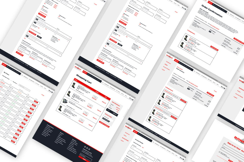
The team at Banner Fire had a vision: to be the Amazon for firefighters and first responders to make it as fast and easy for these community heroes to access the equipment they need to stay safe while saving lives. In order to do this, they sought to improve the e-commerce functionality on their website to better integrate with their ERP system. This would make their large inventory and newly expanded product offerings available to customers online, providing an easier buying experience and better access to their full suite of products.

The Project

Improving Automation to Save Time and Reduce Error Risk

Banner Fire warehouses approximately 8,000 products on any given day. To be effective, they needed to bring more automation to the integration between their ERP system and the e-commerce functionality on the website. Prior to this project, Banner Fire team members worked daily with the ERP to pull any information that had changed (prices, descriptions, titles, SKU numbers, manufacturer updates, etc.), and manually entered changes into the e-commerce platform, a time-consuming and error-prone process.

Enhancing Experiences

To reflect Banner Fire’s position as a market leader and align with their vision of becoming the Amazon for first responders, the UI/UX of the e-commerce functionality needed to be simplified and streamlined. We also saw the opportunity to enhance Banner Fire’s brand to better tell the story of the problems they solved every day for firefighters and first responders so that they could build deeper connections with their audience.

Understanding the Market

After leading our Winning Zone and persona workshops with Banner Fire and conducting independent research, we learned how decision-makers in the fire industry shop for equipment. Understanding this buyer’s journey allowed us to make better decisions in shaping the user flows and UI/UX of the Banner Fire website.

On the marketing side of the website, we also worked to flesh out the parts and services content and online experience. While parts and services were once viewed at Banner Fire as a separate branch, they have since been integrated with the organization as a whole, and we brought that integration to life with the website redesign and restructure.

Automating Processes for Accurate Lead Times

Working directly with Banner Fire’s ERP provider, we set up a system that would check for updates every night, and then push those changes to the e-commerce portion of the site. Now, any time a price, product description, SKU, or other product information changes, the site automatically shows the most up-to-date information for more accurate lead times. Some equipment used by first responders comes with long lead times, so having accurate lead times on the site helps Banner Fire customers make informed decisions and understand expectations for when products will arrive.

Updating the Look and Feel

Automated processes? Check. An easier, more navigable user experience? Check. From a back-end perspective, Banner Fire’s site saw an elevated presence that not only streamlined processes but presented information in a way that makes sense. But first impressions count, and we wanted to ensure their site’s look and feel complimented the functionality.

Banner Fire has always been a team that’s proud to serve those who serve their communities during emergency situations. With the website redesign, we incorporated cinematic imagery that captures the bravery and dedication of the firefights and first responders that Banner Fire supports. We also introduced a refreshed color palette that modernized the brand and allowed us to draw more attention to strategic calls to action.

0%

Bounce Rate Decline

0%

Page Session Increase

Results

Before the launch of the new e-commerce-ERP integration, creating or updating a single product would take as long as 10 minutes for a Banner Fire team member. The more than 8,000 products Banner Fire offers would add up to nearly 1,300 hours of manual work! By creating an automated inventory process, Banner Fire’s website has provided approximately $200k in labor cost efficiencies, with that number growing as new products are added and updated.

Since the launch of the site, we’ve seen more meaningful user engagement. Pages per Session has increased by 4.08% and the Bounce Rate has declined by 10.53%.

“We want to be the Amazon of fire equipment.”

Our Work

A Brand Electrified

About Holt Electrical Supplies

INDUSTRY: Full-line electrical distribution

Founded in 1960 in a drugstore basement, HOLT has grown into a regional powerhouse with seven locations and over 200,000 square feet of distribution space.

Results

Refreshed branding and a cohesive go-to-market messaging celebrating the “middle man”

0%

Increase in Website Users

0%

Increase in Website Sessions

A Brand Electrified

HOLT has always done things a little bit differently than their competitors in the industry. In a sea of giant competitors with about as much of a personal touch as Amazon.com, HOLT has managed to grow and go the extra mile to help their customers win.

We met Ryan Holtzman (CEO) and Shane McCorkle (VP of Business Development) at a leadership training event, and in getting to know them, it became clear that HOLT’s brand image wasn’t doing justice to the passion and capabilities of the company. And with more and more potential customers in the industry buying products directly from manufacturers, we needed to demonstrate the value of a distributor—a middle man—that cares about its customers.

Not only did we want to take Ryan and Shane out for beers immediately, but we wanted to help their business even more—we knew that our team could help refresh HOLT’s brand and get the message out with a marketing and communications strategy to match.

Shedding Light on HOLT’s Competitive Advantage

Our goal was to capture and communicate the energy that HOLT’s team and customers knew and turn it into a results-generating asset. We began by constructing the strategic building blocks of HOLT’s brand platform—conducting research on their competitors, interviewing customers, and learning their business inside and out. While the fuller picture was coming together, we dove right into tactical deliverables like press releases and promotional communications.

Logo, Visual Identity, & Brand Voice Overhaul

With a firm grip on HOLT’s value proposition, target audience, and brand personality, we created a new logo that conveyed the energy of the company and signaled the launch of a new phase of growth. We then developed an entirely new visual system and brand voice that did what Ryan, Shane, and the whole organization had done so well from the beginning—cut the B.S. and make a real difference.

Website Launch

A keystone of the new brand launch was a completely new website, featuring more robust services and careers sections and the HOLT Toolbox—a collection of resources including a new blog, videos, and more.

Ongoing Content Strategy & Email Marketing

We also launched a regular company email newsletter that keeps subscribers informed of new product promotions, learning content, and industry news, in addition to activating social media channels to broaden HOLT’s reach. Finally, our team consistently supports HOLT’s sales outreach efforts with highly targeted email campaigns to engage various customer segments.

Measures of Success

At every level, team members at HOLT have embraced the new brand by proudly sporting new swag and speaking the language of the middle man who cuts the B.S. The HOLT website has garnered significantly more attention since the refresh, more than doubling organic traffic and total website sessions. HOLT has also seen terrific results in attracting qualified candidates for career opportunities in the company. Prior to the new website launch, the company had faced challenges in garnering applications for open positions. Since launch, Ryan and his team have told us that they now struggle to keep up with the interest!

0%

Increase in Facebook Impressions

0%

Increase in Organic Traffic

“They’re adaptable. There’s been a lot of changes…and they’ve kept up with it. goBRANDgo! not only keeps up…they stay out in front of it.”

Our Work

Plastic Distribution and Fabrication Company

About Cope Plastics

Industry: Plastic Distribution and Fabrication
The Transformation: Revitalized Branding and Digital Presence

Cope Plastics, one of the largest plastic distribution & fabrication companies in the country partnered with goBRANDgo! to redefine its market presence through new messaging, branding, and the launch of a new website. These foundational enhancements were designed to not only modernize the company’s brand to accurately represent the sophistication of their operations but also to optimize its digital footprint in a competitive landscape. Following this launch, the focus shifted towards maximizing the effectiveness of Cope Plastics’ full-funnel marketing program through improved data collection and analysis.

Results

An increase in web sessions of 19%, and that leads increased to 58% and sales-qualified leads were up 67%

0+

New Customers

0

Reactivated New Customers Generated from Web Forms

The Challenge: Leveraging Data to Fuel Growth

Despite these advancements, the challenge of collecting and making meaningful insights of marketing data remained. Antidotally we knew the refreshed brand and website were making an impact but we set out on a mission to provide tools for their internal marketing team to help prioritize strategic activities and support the sales team on a more integrated level than was traditionally possible. This couldn’t mean stopping at the increased website traffic and engagement.  It meant truly understanding their customers’ digital buying journey, what strategies were making the most impact and how marketing conversions translated to sales conversations and ultimately closed won business.

The Solution: Customized Marketing Dashboard by goBRANDgo!

To bridge the gap between marketing efforts and sales outcomes, goBRANDgo! developed a bespoke marketing dashboard. This tool was tailored to foster seamless collaboration between the sales and marketing teams, ensuring alignment towards common goals and enabling strategic, data-driven decisions.

Working closely with Cope Plastics, we pinpointed essential metrics and streamlined the reporting process. Like many manufacturers a sophisticated tech stack is not always readily available to provide the data sets in the exact way to achieve meaningful insights . The solution needed to be a mix of easy to access data – like Google Analytics, the integration of website data, and spreadsheets fed from internal systems. The result was a user-friendly digital data visualization dashboard that provided real-time insights into marketing activity from top of the funnel through conversion to active and won sales pipeline.

The Impact: Data-Driven Success and Enhanced ROI

The introduction of the marketing dashboard signified a turning point for Cope Plastics. Armed with detailed insights and a clear understanding of marketing performance, the company could strategically allocate resources, resulting in a marked increase in ROI and the achievement of marketing and sales objectives.

Notable achievements included:

  • Comprehensive Sales Insights: The dashboard illuminated the journey from initial engagement to qualified lead, highlighting the impact of various marketing efforts.
  • Optimized Online Engagement: Detailed analysis of website traffic and content effectiveness allowed for targeted improvements, enhancing lead generation capabilities.
  • Campaign Performance Analysis: The success of targeted marketing initiatives, including email, paid search, and social media campaigns, was meticulously tracked, informing future strategy with actionable data.
  • An increase in web sales of 67% and profits of 71% YOY

The collaborative effort to centralize and leverage marketing data not only streamlined Cope Plastics’ approach to lead generation but also established a scalable model for achieving growth objectives efficiently and effectively.

0%

In web sales

0%

Profits YOY

This knowledge set presents immediate insights into not just where to spend, but how and when to spend. We never thought we’d have a tool like this with our resources.

Our Work

Sodick Rebrand: Advancement by Design

Sodick, Inc. is a global manufacturer of EDM and additive manufacturing machine tools, known in the sector for delivering the highest possible precision for parts that require fine detailing and the tightest tolerances. They partnered with us to refresh their brand presence in the US market.

With a brand identity that did not truly represent the innovation and advancement inside the company, we embarked on the project with the goal of making a splash at the influential IMTS 2022 trade show. Another key initiative of the partnership was to improve the website experience with valuable content that highlighted not only Sodick’s machines but also its full line of EDM consumables.

Sodick Verbal Identity: Spending Words Wisely

GBG conducted in-depth brand research and developed the “Advancement by Design” tagline to convey Sodick’s spirit of pioneering innovation with purpose, and then crafted Sodick’s brand voice to align with that ethos. The copy style utilizes crisp, minimal language, and its strategic brevity focuses the messaging on Sodick’s core differentiators without unnecessary embellishments. The writing aims to convey pragmatism and purposefulness in describing manufacturing advancements in the context of how they solve customer problems and help them achieve their goals.

Sodick Visual Identity: Cinematic, Yet Minimal

The streamlined verbal identity complements the sleek visual branding for a cohesive and consistent brand experience. Sodick’s visual identity centers on a minimal yet cinematic aesthetic to let the advanced technology shine. The color palette strategically incorporates a new Sodick green gradient to show energy and forward motion. This lively green pops against dark-mode photography. The strategic use of color and composition in the visual identity brings the essence of “advancement by design” to life.

The Debut and Beyond

The sleek, technology-forward Sodick rebrand was a hit at IMTS 2022. Web traffic and social engagement increased as the new website rolled out additional features and content over time. The sales team eagerly participated in case studies and testimonials to share the brand story. With a consistent identity matching the advanced machinery, Sodick’s refreshed brand continues to gain traction with its manufacturing audience.