Solution: Market Intelligence

Our Work

A Brand Electrified

About Holt Electrical Supplies

INDUSTRY: Full-line electrical distribution

Founded in 1960 in a drugstore basement, HOLT has grown into a regional powerhouse with seven locations and over 200,000 square feet of distribution space.

Results

Refreshed branding and a cohesive go-to-market messaging celebrating the “middle man”

0%

Increase in Website Users

0%

Increase in Website Sessions

A Brand Electrified

HOLT has always done things a little bit differently than their competitors in the industry. In a sea of giant competitors with about as much of a personal touch as Amazon.com, HOLT has managed to grow and go the extra mile to help their customers win.

We met Ryan Holtzman (CEO) and Shane McCorkle (VP of Business Development) at a leadership training event, and in getting to know them, it became clear that HOLT’s brand image wasn’t doing justice to the passion and capabilities of the company. And with more and more potential customers in the industry buying products directly from manufacturers, we needed to demonstrate the value of a distributor—a middle man—that cares about its customers.

Not only did we want to take Ryan and Shane out for beers immediately, but we wanted to help their business even more—we knew that our team could help refresh HOLT’s brand and get the message out with a marketing and communications strategy to match.

Shedding Light on HOLT’s Competitive Advantage

Our goal was to capture and communicate the energy that HOLT’s team and customers knew and turn it into a results-generating asset. We began by constructing the strategic building blocks of HOLT’s brand platform—conducting research on their competitors, interviewing customers, and learning their business inside and out. While the fuller picture was coming together, we dove right into tactical deliverables like press releases and promotional communications.

Logo, Visual Identity, & Brand Voice Overhaul

With a firm grip on HOLT’s value proposition, target audience, and brand personality, we created a new logo that conveyed the energy of the company and signaled the launch of a new phase of growth. We then developed an entirely new visual system and brand voice that did what Ryan, Shane, and the whole organization had done so well from the beginning—cut the B.S. and make a real difference.
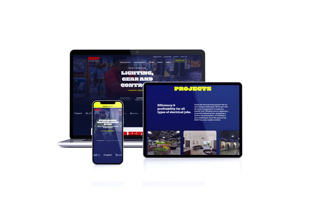
Website Launch

A keystone of the new brand launch was a completely new website, featuring more robust services and careers sections and the HOLT Toolbox—a collection of resources including a new blog, videos, and more.

Ongoing Content Strategy & Email Marketing

We also launched a regular company email newsletter that keeps subscribers informed of new product promotions, learning content, and industry news, in addition to activating social media channels to broaden HOLT’s reach. Finally, our team consistently supports HOLT’s sales outreach efforts with highly targeted email campaigns to engage various customer segments.

Measures of Success

At every level, team members at HOLT have embraced the new brand by proudly sporting new swag and speaking the language of the middle man who cuts the B.S. The HOLT website has garnered significantly more attention since the refresh, more than doubling organic traffic and total website sessions. HOLT has also seen terrific results in attracting qualified candidates for career opportunities in the company. Prior to the new website launch, the company had faced challenges in garnering applications for open positions. Since launch, Ryan and his team have told us that they now struggle to keep up with the interest!

0%

Increase in Facebook Impressions

0%

Increase in Organic Traffic

“They’re adaptable. There’s been a lot of changes…and they’ve kept up with it. goBRANDgo! not only keeps up…they stay out in front of it.”

Our Work

Plastic Distribution and Fabrication Company

About Cope Plastics

Industry: Plastic Distribution and Fabrication
The Transformation: Revitalized Branding and Digital Presence

Cope Plastics, one of the largest plastic distribution & fabrication companies in the country partnered with goBRANDgo! to redefine its market presence through new messaging, branding, and the launch of a new website. These foundational enhancements were designed to not only modernize the company’s brand to accurately represent the sophistication of their operations but also to optimize its digital footprint in a competitive landscape. Following this launch, the focus shifted towards maximizing the effectiveness of Cope Plastics’ full-funnel marketing program through improved data collection and analysis.

Results

An increase in web sessions of 19%, and that leads increased to 58% and sales-qualified leads were up 67%

0+

New Customers

0

Reactivated New Customers Generated from Web Forms

The Challenge: Leveraging Data to Fuel Growth

Despite these advancements, the challenge of collecting and making meaningful insights of marketing data remained. Antidotally we knew the refreshed brand and website were making an impact but we set out on a mission to provide tools for their internal marketing team to help prioritize strategic activities and support the sales team on a more integrated level than was traditionally possible. This couldn’t mean stopping at the increased website traffic and engagement.  It meant truly understanding their customers’ digital buying journey, what strategies were making the most impact and how marketing conversions translated to sales conversations and ultimately closed won business.

The Solution: Customized Marketing Dashboard by goBRANDgo!

To bridge the gap between marketing efforts and sales outcomes, goBRANDgo! developed a bespoke marketing dashboard. This tool was tailored to foster seamless collaboration between the sales and marketing teams, ensuring alignment towards common goals and enabling strategic, data-driven decisions.

Working closely with Cope Plastics, we pinpointed essential metrics and streamlined the reporting process. Like many manufacturers a sophisticated tech stack is not always readily available to provide the data sets in the exact way to achieve meaningful insights . The solution needed to be a mix of easy to access data – like Google Analytics, the integration of website data, and spreadsheets fed from internal systems. The result was a user-friendly digital data visualization dashboard that provided real-time insights into marketing activity from top of the funnel through conversion to active and won sales pipeline.

The Impact: Data-Driven Success and Enhanced ROI

The introduction of the marketing dashboard signified a turning point for Cope Plastics. Armed with detailed insights and a clear understanding of marketing performance, the company could strategically allocate resources, resulting in a marked increase in ROI and the achievement of marketing and sales objectives.

Notable achievements included:

  • Comprehensive Sales Insights: The dashboard illuminated the journey from initial engagement to qualified lead, highlighting the impact of various marketing efforts.
  • Optimized Online Engagement: Detailed analysis of website traffic and content effectiveness allowed for targeted improvements, enhancing lead generation capabilities.
  • Campaign Performance Analysis: The success of targeted marketing initiatives, including email, paid search, and social media campaigns, was meticulously tracked, informing future strategy with actionable data.
  • An increase in web sales of 67% and profits of 71% YOY

The collaborative effort to centralize and leverage marketing data not only streamlined Cope Plastics’ approach to lead generation but also established a scalable model for achieving growth objectives efficiently and effectively.

0%

In web sales

0%

Profits YOY

This knowledge set presents immediate insights into not just where to spend, but how and when to spend. We never thought we’d have a tool like this with our resources.

Our Work

Sodick Rebrand: Advancement by Design

Sodick, Inc. is a global manufacturer of EDM and additive manufacturing machine tools, known in the sector for delivering the highest possible precision for parts that require fine detailing and the tightest tolerances. They partnered with us to refresh their brand presence in the US market.

With a brand identity that did not truly represent the innovation and advancement inside the company, we embarked on the project with the goal of making a splash at the influential IMTS 2022 trade show. Another key initiative of the partnership was to improve the website experience with valuable content that highlighted not only Sodick’s machines but also its full line of EDM consumables.

Sodick Verbal Identity: Spending Words Wisely

GBG conducted in-depth brand research and developed the “Advancement by Design” tagline to convey Sodick’s spirit of pioneering innovation with purpose, and then crafted Sodick’s brand voice to align with that ethos. The copy style utilizes crisp, minimal language, and its strategic brevity focuses the messaging on Sodick’s core differentiators without unnecessary embellishments. The writing aims to convey pragmatism and purposefulness in describing manufacturing advancements in the context of how they solve customer problems and help them achieve their goals.

Sodick Visual Identity: Cinematic, Yet Minimal

The streamlined verbal identity complements the sleek visual branding for a cohesive and consistent brand experience. Sodick’s visual identity centers on a minimal yet cinematic aesthetic to let the advanced technology shine. The color palette strategically incorporates a new Sodick green gradient to show energy and forward motion. This lively green pops against dark-mode photography. The strategic use of color and composition in the visual identity brings the essence of “advancement by design” to life.

The Debut and Beyond

The sleek, technology-forward Sodick rebrand was a hit at IMTS 2022. Web traffic and social engagement increased as the new website rolled out additional features and content over time. The sales team eagerly participated in case studies and testimonials to share the brand story. With a consistent identity matching the advanced machinery, Sodick’s refreshed brand continues to gain traction with its manufacturing audience.

Our Work

Cope Material Selector Tool

We took hundreds of plastic materials and organized them according to specifications in an electronic database for this plastics fabricator and distributor, which allowed us to build an online material selection tool that gives website visitors the ability to select the range of products that fits the criteria of their project. This tool not only provided convenience for customers, but also generated lead flow for the sales team and automated many of the questions they would normally have to ask over the phone. The material selection tool saves time, drives sales, and provides a valuable resource for the company and its customers.

Our Work

Paulo Brand Identity

Paulo leads the commercial thermal processing industry with its datagineering approach — a term we coined that communicates blending the best people, systems, and equipment to produce the most accurate, repeatable results in heat treatment, brazing, and metal finishing. To convey Paulo’s precision and engineering prowess, we created custom schematic illustrations as a visual element along with custom iconography. We modernized the visual system by replacing the brand’s previous beige with white and introducing blue as a strategic tertiary color while keeping the red that has been a part of the brand’s legacy since 1943.

Objective

To communicate how Paulo’s superiority in repeatability and results solves problems for advanced manufacturers in the world’s most highly regulated industries

Our Work

Multilanguage Website for Global Heat Treatment Manufacturer

About the Client

INDUSTRY: Expertly engineered vacuum and atmosphere furnaces

This client is a global manufacturer of heat treatment furnaces, industrial vacuum furnaces, atmosphere furnaces, and supervisory controls for thermal processing markets. Some of these markets include aerospace, automotive, medical, and commercial heat treaters with their customer bases being primarily in the U.S., Germany, and Asia.

Results

Created a new website with a fresh and modern feel with an enhanced user experience and specialized translation for global customers.

0%

User Increase

0%

Session Increase

The Project

Combining, Streamlining, and Enhancing UX

A key objective of this project was to merge six separate websites into a single global site that could be translated into many languages so that customers in any market across the world could access the same enhanced experience and content. The consolidation of six sites into one also meant that the client’s marketing team could streamline its website update process — only having to make updates in one place instead of across six different sites.

As a category leader in heat treatment technology, the new website needed to showcase its products in a way that did justice to their quality and innovation. We worked with a 3D rendering artist to bring furnace schematics to life that demonstrated the complexity and scale of the client’s engineering capabilities.

Finally, the site needed a restructuring of its sitemap to simplify user paths and drive more conversions. We worked with the client to create intuitive user journeys, ensuring that each session would be guided toward a particular goal. We also stripped back the amount of content on the site to reduce the opportunity for translation errors and create a modern, sleek experience across all copy and visuals.

The Rebrand

In conjunction with the website design and build, we took the opportunity to assist this client in a branding refresh that would support their growth into the future. 

Working with the client’s red and white palette, we introduced a tertiary dark navy blue to bring warmth, depth, and dimension. Red, white, and blue can often feel very “USA” if designers aren’t careful, but this combination was paired with light grayscale elements and deployed strategically so that the colors play well together in any market.

Evoking the client’s custom engineering capabilities and strong German influence, we selected a new premium typeface for headlines and headers to be used across the site: Halvar Breitschrift. This typeface was created by a German artist and delivers both gravitas and easy readability for both online and print applications. We even took the type a step further by creating a few custom ligatures that gave the font an even more customized feel.

Nothing Lost In Translation

Multilanguage functionality was a key feature of the new site. One of our objectives was to prevent unintentional errors that can sometimes occur when using automated translations for highly technical terms.

On the new site, we implemented advanced translation software that can understand idioms and expressions, ensuring that the copy rendered truly makes sense to users, no matter what their language.

0%

New User Increase

0%

Request Forms Submitted Increa

0+

Sites merged into one

Results

Since the launch of the new site, the client continues to see a growing increase in users, traffic, page views, and conversions.

“We wanted to create a website with a new age, modern feel for customers globally.”

Our Work

Datagineering a Brand on the Web and Beyond

ABOUT THE CLIENT

INDUSTRY: Thermal Processing

Paulo is the nation’s largest privately-held commercial thermal processing company, with six locations across North America providing heat treatment, brazing, and metal finishing services to the world’s most innovative manufacturers.

Results

An updated brand and website that reflects Paulo’s rich history of problem-solving and thermal processing solutions

0%

Increase in Users

0%

Increase in pages per session

Datagineering a Brand on the Web and Beyond

Founded over 75 years ago as a storefront in St. Louis, Paulo is the nation’s largest privately-held commercial thermal processing company, with six locations across North America providing heat treatment, brazing, and metal finishing services to the world’s most innovative manufacturers.

What sets Paulo apart from other heat treaters is its large in-house team of metallurgists and engineers, along with a proprietary business system that takes the human error and guesswork out of thermal processing. Through automation and robust process data, Paulo’s datagineering approach delivers the most repeatable, reliable results for the safety-critical parts people rely on every day. From Grandpa’s titanium hip, to your kids’ car seat buckles, to hot section components in commercial jets, no matter where you are, you’re likely never far away from a part Paulo has touched.

Leveling Up

Paulo’s website had come a long way since it initially launched in the late 1990s, with the company gaining traction through organic search with high-value technical content. With this solid foundation in place, it was time to evolve both the brand and the user experience on the website to reflect Paulo’s cutting-edge capabilities and drive conversions.

We first approached the modernization of Paulo’s brand by introducing a new tagline: Datagineering At Work. Datagineering is the intersection of the best people, systems, and equipment to resolve the challenges and mitigate the risks of thermal processing. 

With this concept at the heart of the brand, we began working on the visuals. An important element that we introduced to convey the engineering and scientific prowess of Paulo was a broad set of custom schematics showing furnaces and complex parts along with precise, intriciate iconography. We also brightened up the color palette, replacing beige with clean white and introducing a tertiary blue hue that, used strategically, lends a technology-forward feel and evokes the sense of temperature control that is central to Paulo’s services.

With the brand elements in place, we then turned our attention to enhancing the website. 

An Ease of Translation

Mega Menu

Paulo’s large array of capabilities makes it a one-stop-shop for its thermal processing customers, helping them simplify their supply chain and streamline vendor partnerships. The previous site menu required the user to hover over multiple nested menus to view all capabilities. To showcase this wide range of services and enhance the user experience, we created a new “mega menu” that organized all the services into a single view. With the new menu, users can get a sense of everything that Paulo offers all at once. 

Augmented and SEO-Optimized Content

Paulo had already built a good foundation for ranking in organic search with keyword-focused content on many pages of the site, but we set out to close the gaps in content across every service offering, industry, and value-added capability. 

We conducted interviews with Paulo experts across the country from the engineering, metallurgy, and sales departments to gather the information we needed to write all of the content we felt Paulo needed to provide a robust resource for its users. From how railroad fasteners are tested for quality to what’s next in additive manufacturing, we learned a ton through this process that helped spark more ideas for future content.

To further boost search rankings, we researched the keywords and phrases that users search for when looking for services that Paulo offers and strategically placed them throughout the content on the site. We also included contextual links to other pages on the site at every opportunity, helping users and search engines find relevant content.

In addition to a robust internal linking structure, we also implemented a tagging system that links similar content to serve users additional content they might be interested in. Each page is tagged with descriptors for processes, markets, parts, locations, and materials, and the site automatically serves relevant articles in a widget on each page. 

0%

Increase in page view

0%

Increase in AVG. session duration

Results

Since the website launch, users, sessions, and pageviews are all trending upward for Paulo. According to a 2021 study, the average time users spend on a page across all industries is only 54 seconds. Paulo’s website is clocking it at an average time on page of over two minutes, which is a sign that users are finding the content valuable and are taking more time to absorb it. 

Our content efforts have also been resonating with our audience, with Paulo’s email newsletter performing well above industry benchmarks. Sent monthly, the newsletter incorporates technical articles, Metallurgy Minute videos, and other related content. As of the first quarter of 2022, Paulo’s open rate was 34.9 percent, while the average for B2B communications is 15.1 percent. Click to open rates were 53.5 percent, while the B2B average is just 10.5 percent. Overall engagement with Paulo’s social media posts is also up nearly six percent. 

We are grateful for our partnership with Paulo and the opportunity to help a business that is so critical to the safety of people everywhere. You can learn more about Paulo and see datagineering at work on the company’s website and LinkedIn page.

“We worked with the nation’s largest privately-held thermal processing company to refine their brand and launch a robust new website.”

Our Work

QFlow Systems

QFlow Systems is a software company that not only provides enterprise content and records management solutions for public and private sector companies, but they also build and implement business process workflows that make work simple for end users. There’s nothing easy about building software, but QFlow Systems makes digitizing processes and complying with strict records management guidelines feel effortless for their customers. To reflect this unique ability, we provided QFlow with a logo refresh, updated brand messaging, and a modernized visual system that helps them stand apart among its competitors.

Objective

To bring the brand image in line with the cutting-edge technology in the QFlow Systems products and communicate its value proposition of making work simpler to customers